
Here we are again, at the starting line of the holiday season – how ready is your website?
You’ve likely been busy with a million things this year, but searches for “christmas gift ideas” start spiking in October. Now’s the time to optimise your site for the shopping surge.
No dramas: Our ecommerce holiday sales playbook is here to help you blast through the priority items – and set new online sales records – this silly season.

Proven Tips & Tactics to Optimise Your Homepage
Optimising your ecommerce website for holiday sales starts with the virtual front door to your store: your site’s homepage.
Checkout flows, landing pages and marketing channel campaigns are also critical – and we’ll cover those in parts 2-3 – but chances are, most of your ecommerce site traffic will still arrive via the homepage.
That’s why the following areas are so important to get right, to convert more new and repeat visitors into valued, happy customers.
Top Priority: Usability on desktop and mobile browsers boosts visibility
We all know mobile shopping has increased dramatically in recent years, and smartphones now account for more than 61% of holiday ecommerce sales.
But did you know that mobile usability is one of the top factors Google uses to decide how to show your site in search results?
That means there’s not only a direct correlation between how intuitive and easy it is to use your site on mobile devices, and how well it drives sales, but also with how likely the site is to appear higher in search results.
There are many other factors impacting organic search rank (SEO is a huge topic), but for now, you’ll want to get the basics nailed down on both desktop and mobile, including:
Navigation and menu options
Have you got all the best options in prominent places?
For ecommerce sites, some type of popular category should be in your first few navigation options: e.g., “Best Sellers” or “Most Popular” or “New Arrivals” pages. Also, prominent links to sections for Sales or Clearance can make a huge impact on conversions.
Do all the navigation links look and work right on mobile?
Many times, on smartphones, the compressed navigation menu (a.k.a., hamburger menu) can appear in the wrong place – like smack in the middle of the page, not aligned top left or right, where it typically belongs.
Are nested and sub-navigation items working properly?
If your desktop site uses nested navigation bar items, make sure these are intuitive for mobile users, with a clear arrow, or plus sign or other indicator letting them know to navigate to the next level/page down.
Are the font and copy sizes appropriate?
Given the much smaller screen real estate with mobile, you’ll want to ensure the font sizes in navigation options are large enough to clearly read and use, and that any formatting (bold, italics) is helpful, not distracting.
Are there extraneous options to remove?
Streamlining the navigation options is often a good idea, especially for mobile shoppers. There are many ways to do this, from removing the “Home” option, or “hiding” empty collections to paring down huge categories.
Example: Let’s say you have a gift hamper store. With a “Shop By Occasion” list of holiday options, you could hide Easter, Valentine’s Day, Mother’s Day, Father’s Day for Oct-Jan, and move the Christmas Early Bird Deal link from the bottom of the navigation list up to the top.

Site speed and page load times
How quickly does your ecommerce site load on desktop and mobile?
Usually there’s some difference, and it’s important to note that Google uses this as another key usability factor in evaluating your site.
Without getting too deep in the technical weeds, Google’s Core Web Vitals metrics measure user experience with page content loading speed and accuracy.
Simply put, the better your site scores, the better the user experience, and in turn the conversions. According to Google research, as page loading times go from 1 second to 5 seconds, the bounce rate probability increases by 90%.
That’s why it’s critical to check Google’s Search Console tool for your site’s Core Web Vital scores and recommendations for improvement. If there are quick fixes your developers can make, get those updates into the queue!

Strong first impressions
What do visitors see right away, when they land on your homepage?
Is it a bold brand image and tagline that lets shoppers know they’re in the right place, what they can expect from the site, and where to go next?
Or is it a single product or collection/category, with a featured image and link straight to the shopping experience?
While there’s no single right answer that applies to every ecommerce site, it’s easy to know if you’re getting it right: you’ll have a low bounce rate.
According to Google research, bounce rates between 20-45% are good for ecommerce sites; below 20% is amazing; but above 45%, there’s plenty of room to improve.
What first-screen elements can help increase ecommerce conversions?
Again, there’s not a one-size-fits-all answer, but there are certainly common factors that will reduce bounce rates, let visitors know they’re potentially in the right place, encourage them to explore your site further – and start shopping.
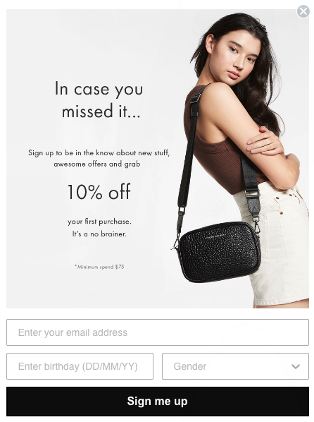
These elements typically include a prominent, compelling offer or hook to kickstart the buying process.
Example: An email opt-in popup offering 10-15% off first-time orders for new visitors is fairly common and can work well. Plus, this enables remarketing via email, which is essential for generating more long-term sales.
- Other, holiday-specific examples to consider include:
- Special holiday-only offers, e.g., ClickFrenzy or Black Friday deals
- Special holiday-only products, e.g., craft beer advent calendars
- Gift card options, virtual or delivered
- Free express shipping to ensure Christmas delivery (with cutoff dates)
What other tools can help boost conversions?
The aforementioned email popups and overlays with strong offers should be prominent but not annoying. Use a few key options to minimise the user annoyance factors: a prominent close option, not popping up on every page load, or every time a visitor hits the homepage in a single session, etc.
So-called “hello bars” or banner bars that appear and stay at the top of your site pages can also promote special offers, such as Free Shipping options at a certain purchase amount, or limited-time offers. They can help free up other areas of your site pages, but keep the offers and incentives visible during the visitor’s navigation of your site, which can boost conversions.
Chatbots or live chat options might also work well with your site’s customers, depending on the products. Look at the frequently asked questions you get about things like sizing, or technical specs and details, support requests, etc. Automated chat options can help reduce back-and-forth and give a bump to sales (just remember to keep your FAQs page updated, too).
Part 2: How to Optimise Your Product Pages and Checkout Flows
That’s a pretty full list, so start with the priority updates your ecommerce site needs most.
Our second article focuses on the next level: optimisation ideas and recommendations for your ecommerce product pages, shopping cart and checkout flows.
Tip: Subscribe below to get our latest articles and insights via email!