
There are plenty of ways to optimise your website for the holiday season, but now that we’re in those frenzied final weeks, we need quick wins that will drive major gains.
That’s why part 1 of our Ecommerce Holiday Playbook focused on homepage optimisation.
Here in part 2, we’ll dig into high-impact tactics and changes you can apply to your product pages, cart pages and checkout flows to increase sales conversions.
Time is running out, so let’s get right to optimising these key areas …
How to Optimise Your Product Pages, Cart and Checkout Flows
1. Product photos & videos
Quality is everything when it comes to product visuals. That means photos and videos that are well-lit, clear and sharp – but still compressed for fast loading, to help keep your page speed scores up.
Photos should also be zoomable and easy to navigate for shoppers who want extra close inspection of details.
Variety is a close second, as shoppers will approach the buying experience from different angles – and your images and videos should reflect those variances.
This means going beyond stock product and catalogue shots with a more diverse mix of imagery and videos, for example:
Lifestyle images: Photos and videos showing your fashion items being worn – like how that dress drapes and flows when walking; how that watch looks with a dark and light sportcoat; how that craft cocktail mix looks in glass with revellers; or how that outdoor gear looks at a campsite in the bush.
These emotion-driven images are essential for firing up the imagination of some ecommerce shoppers, and enticing them to buy online.

“Making of” images: If you’re able to show your products being made, great news – you have an amazing opportunity to connect with buyers who deeply appreciate the craftwork that goes into the products they buy (for themselves and as gifts).
Videos can work especially well here, whether it’s time-lapse footage of art or jewellery being created, or a gift hamper being assembled, or the roasting process for coffee beans.
“Behind the scenes” images: Similar to “making of” images, and sometimes you might even have a combination of the two, but behind the scenes (BTS) images and videos can shift the spotlight a bit more to your team and creative process.
Example: Footage of a fashion shoot for your clothing label, from model styling and location set up, to visuals looking over the photographer’s shoulder during the shoot, to the wrap and a few final images.
Or if you have special packaging, short video and/or shots of your team gift wrapping and packaging orders going out to customers with special touches.
Bonus 1: If you’re making the packaging experience special, you’re far more likely to get a lot of customer unboxing videos with your products – which means more video content promoting you, that you didn’t have to do yourself!
Bonus 2: Beyond improving website conversions, investing in a variety of high-quality images and video as outlined above also greatly expands your marketing options and effectiveness. When these visuals are used in campaigns (say, Meta ads) and carried through on the website, the higher relevance can also help boost your sales.
Formatting images for search/SEO is another critical area that’s commonly missed. In short, this entails using the right file names and “ALT tags” for your photos and videos.
They need to be descriptive and align with search terms and be more visible in search results, both in Google and your own website search (and Bing, etc.). So instead of a bunch of images with filenames like, “earring-00439-final.jpg” perhaps something more along the lines of, “brand-jewellery-earring-collection-name-style-SKU.jpg” and an image ALT tag so search engines and site users can get a quick, contextual description.
That brings us to the next area …..
2. Product descriptions
Many ecommerce sites don’t maximise this area, which is a big mistake. Going hand-in-hand with visuals, product description content is so essential to converting shoppers to customers that it deserves heaps of extra attention. Here are some keys to consider….
More is better than less. While your products don’t need a 500-word description, there’s no need to skimp just to match a page template – “read more” links can keep the visible bits short, while allowing those who want more detail to get it with a quick click.
Bonus: This can also boost your SEO, provided you’re using the additional copy wisely, i.e., including relevant keywords that align with top search terms. Of course, the ultimate is tying it all together with the image formatting for SEO, as outlined above.
Cover all the key criteria. Note that with the “more is better” tips, the length isn’t all about word count, or cramming in all of the keywords – it’s about a user experience that answers the key questions going through your potential customers’ minds while shopping.
For wearable products, that can include colours, sizes, style, materials, fit and feel, details (zip, clasp, hook), seasonality, what it goes with, and much more. Care instructions, the material sourcing (e.g., ethical fashion) and other details can even be split into separate tabs to keep the sections streamlined.
Here’s a great example from the Spell website:
A new style for us, our Mossy Bias Cut Midi Dress is quickly becoming a Spell team favourite! As this one is bias cut, the fabric stretches and molds to your body shape, falling over your curves and accentuating all the right places. Our Mossy Bias Cut Midi is a tiny bit vintage and a tiny bit chic. We are obsessed with its shape and colourway featuring our hand drawn Mossy Print in timeless golds, browns and dusky yellows. It is unlined with an invisible zip at the side for easy wear and (I can’t stress this enough) it’s just so damn flattering! Pair this back with tan slides and a gorgeous wide brim hat while exploring the local markets or team with a cute heel and bold lip for that sunset soiree on the terrace.
– Crafted from our preferred fibre 100% LENZING™ ECOVERO™ Viscose Fujet
– Unlined
– Invisible zip opening at side
Don’t just tell, sell. Striking the right chord with your product copy is a balancing act. You want to nail the practical parts – essential details that matter – while your evocative, imaginative copy helps shoppers feel the emotions of buying, owning and using your products (joy, relief, comfort, etc.) and/or being the hero that gifts them at the holidays.
The holiday season has its own built-in urgent deadlines and fear of missing out (FOMO) motivation factors, of course. But don’t rely solely on the cart and checkout process to do all the heavy lifting on cross-sells and upsell opportunities!
If you have limited stock, special editions, exclusive offers (e.g., buy X and get matching Y) or similar, make sure your product descriptions promote those as well as the cart and sales checkout process. (Plus, add these to your email sequences, from abandoned product, cart or wishlist to cross-sell emails.)
Price anchoring is another simple yet effective technique to help increase sales. Most ecommerce platforms make it easy to add this to your products, category and site pages, so if you haven’t tested this area yet, now’s the time.
(Not familiar with price anchoring? It’s using a comparison or sales price, like recommended retail price, to demonstrate savings, a bargain or discount.)


3. Product Reviews & Social Proof
These days, shoppers are overwhelmed with options – so when they buy, they’re looking for companies and products they can trust.
Strong product reviews and testimonials are a key differentiating factor year-round, but even more so at holidays, when people want certainty that their gifts will exceed expectations.
Product reviews and testimonials are pretty straightforward, the biggest challenge is in getting them. That’s where using automated emails with buyers is your best bet here, so check out how your email platform can make this easier for you.
Even if you’re not super tech-savvy, there are several testimonial tools that can make this easy, and request customers to share product reviews to the platform/s of your choice (Shopify, TrustPilot, Google, Facebook).
What will level that up even further? Adding an attractive special offer to encourage reviews.
That might be a gift code, discount or bonus on their next order, or entry into a giveaway or monthly competition. Or you could showcase glowing reviews in your social media feeds if your customer base responds to that.
Social proof can overlap with strong product reviews, but what we’re referring to here is credibility and authority for your company and brand. This often comes from external sources like media coverage, well-known partners or brand ambassadors.
If you’ve had TV coverage, congrats, that’s awesome – the clip and logos are already on your homepage and in your social media fees, right?
Or, let’s say you’ve had a product/s featured in a “Best Wedding Gifts” post on Brides.com or TheKnot.com. That goes on your website and social feeds.
The same applies if a public figure is using and loving your brand or products. For instance, if an Olympic swimmer uses and loves your pool covers and swim jets, and tags you in their Instagram post – get that onto your site and into your social media feeds!


4. Product FAQs, Terms & Conditions
Now let’s get into the nitty-gritty details, which aren’t nearly as sexy as the visuals, sales copy and positioning, but still play a vital role in enticing site visitors to push through the buying and checkout process.
Product FAQs can live on their own page, but work even better when they’re integrated with product descriptions.
One way to do this cleanly is with the “accordion format” that opens up the answer in a sliding panel with a click on the frequent question. This not only streamlines the page layout, but you can use clicks data to see which FAQs get the most action, and find new (better) ways to answer these questions in descriptions and elsewhere.
Another step up is using rich media – images or short videos – to handle FAQs, especially if the answer is fairly long when written out, or has multiple steps (like product assembly).
Note that, like the product images themselves, these images and videos can again be extra useful in other areas of your website, social feeds, and so on, to help encourage sales.
Product Terms & Conditions might be different than your company/website T&C content, and there’s a wide range here that might include policies around product repairs, warranties, guarantees, replacements, and more. These areas might even be separate pages on your site, with links from your product pages, but the tips here are fairly consistent.
Scannability is extra helpful. We’re all used to thick, hard-to-read legalese with terms and conditions pages – and sure, those 10-line paragraphs that very few of us ever read in detail do need to be there.
However, some websites also include a plain-English summary or overview that gets the key message across concisely. Another helpful approach is to include shorter paragraphs with multiple sections, and descriptive subheads, to improve the readability of these sections.
5. Cart & Checkout Pages
Ideally, your cart-to-checkout experience is a smooth, effortless experience for shoppers who like a product(s), want to buy it, and just need an easy budget to get over the line.
With that in mind, rather than get stuck in the details with each component, let’s breakdown a few of the most important areas to focus on to reduce abandoned carrs and lift your sales conversions.
Desktop- and mobile-friendly cart and checkout pages. The landscape really has shifted to mobile-first in the past few years, from how Google evaluates and indexes websites, to the percentage of shoppers buying on their mobile devices.
Have you tried buying from your website on mobile devices lately? Or had user experience pros, or your team, do so? You may find the process needs a bit of tweaking compared to the desktop version.
Examples to look out for:
- Are important product details all visible on mobile device screens?
- Is the font size big enough to be legible?
- Are images prominent enough (and do photos and videos resize or fit the vertical screen format)?
- Are the critical buttons in the cart and checkout flow, like Update Quantity or Buy Now, spaced well enough for touch screens? What about so-called radio button selection items, like payment options (credit card, PayPal, Afterpay, Zip, etc.)?
- Are too many images and logos crowding the cart and checkout pages on mobile, or are they resizing correctly?
- If your site uses live chat overlay options, do they block important “View Cart” and “Buy Now” buttons in a desktop cart sidebar? (Yes, this happens.)
The good news is that, again, most ecommerce platforms will handle these details already, especially if your site is built on mobile-first themes.
However, it’s not 100% foolproof, and errors on some devices can lower your conversion rates, increase your bounce rates and knock down your site usability scores. So it always pays to consistently check these areas, particularly going into the holiday shopping season.

Shipping and delivery options. Since free shipping is the #1 motivator for many shoppers, and holiday gift delivery timing estimates are just as critical, nailing it with clarity around these areas in the cart and checkout is a must.
Even if you already have “Free Shipping” listed all around your site, from the Hello Bar and homepage to every product page and in the page footers, you still want it to be prominent in your cart and checkout flow.
Make sure there’s absolutely no question or confusion as to whether a shopper’s order will qualify for free shipping – and when it’s likely (or better yet, guaranteed) to arrive at their door, or their gift recipient’s door.
Cross-sells, bundles, upsells and add-ons. There’s a wide range of options here, but if you haven’t got those all figured out well ahead of the holidays, let’s focus on the fast and the furious tweaks you can make without a site redesign.
If you have a multi-step checkout flow with two or more cross-sell or upsell options – like related products, gift wrap, express shipping or insurance – check your drop-off rates in the checkout funnel. Are they all working like they should, or is there a significant number of shoppers skipping (or worse, abandoning the cart) at certain steps?
If you don’t have a checkout flow that includes such options, simplified testing of these areas could give you some big wins.
Example: Adding a few cross-sell products via a “People Also Buy/Bought” or “Styles We Think You’d Like” section in the cart can greatly increase sales and average order values.
Upsells can include gift wrapping – which is also useful as a free incentive to lift conversions, and offer an outstanding customer experience …. and to help generate five-star reviews – or shipping options like insurance, expedited delivery options, and so on.
Remember, these types of options make more sense in the cart and checkout process if they are reducing friction, not adding to it. Plus, they also should be smoothly integrated with your site and product pages, not popping up here for the first time.
Payment options. This is another area where taking your customer base into consideration can make an impact. Example: If you’re selling high-end or luxury items, you may not need to offer every single “buy now, pay later” (BNPL) option out there (Afterpay, Klarna, Zip, etc.).
While it might not hurt to have them, if you’ve only had a handful of transactions in recent months with a full stack of BNPL options on your site, your checkout flow might be cleaner and convert better (?) with fewer logos and options that your buyers are rarely using.

On the flip side, you might find that adding BNPL options, or PayPal, G Pay, Apple Pay, Amazon Pay and other widespread payment options is a fast, powerful way to increase your ecommerce orders this season.
If you don’t have the time or resources available to test every single option, try asking your best customers, e.g., with a quick email/feedback survey, and check both your website and ecommerce platform analytics for payment option trends.
Guest/Express Checkout vs Create Account. There are pros and cons to consider with offering shoppers a guest checkout. Once again, your products and customers can help you decide which is the better way to go.
Consider this: While a guest checkout can offer a faster shopping experience for buyers, it could also lead to increased overhead and hassles for your shop around managing returns and exchanges, tracking reviews and refunds, and other customer support issues.
Also, if your products are likely to be repurchased often by the same buyers – for instance, pet foods or products, clothing, goods for kids, select food and beverages – and/or you offer subscriptions, then prioritising Account Creation in the checkout is really a no-brainer.
With most ecommerce platforms, it’s not too difficult to offer both options. Then you can compare the uptake and value derived from each segment (average order value, average lifetime value, repeat order rates, refund rates). Then you can make an informed decision about whether to focus on one or both options, based on their impact on your business.
Offer a cool post-purchase experience. Does your website give customers a happy feeling after they click to confirm their purchase? That should be the goal.
You can spark that joy right away, from the Thank You page to the order confirmation email, with a few touches that will help your brand stand apart while they’re waiting to receive their order (or effusive thank you’s from holiday gift recipients).
Example: You could add a surprise/secret discount, in the confirmation email or a follow-up email, with $20 off or 10% off their next order with you.
Or you could let customers know how many rewards points they’ve earned toward their next purchase.
One standout post-purchase email we’ve seen offers customers two different options for rewards, based on the type of review they leave for the product they bought: $10 for a text review or $30 for a text review with images.
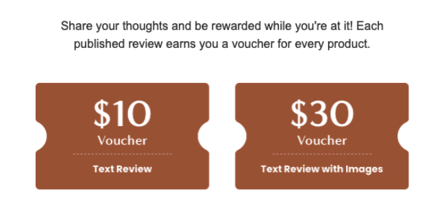
Think about how you can get creative with rewards and encourage glowing reviews (and/or future purchases) at the same time, and use your Thank You page and post-purchase emails to test the best ideas. (Check out this post for more ways to increase online sales.)
Coming Up Next: How to Optimise Your Holiday Marketing Campaigns
Once again, there’s a lot to get you started with there, and the clock is ticking, so apply the ideas, examples and action steps that work best with your situation.
Our third and final Playbook article will focus on tying these ecommerce website optimisation ideas and recommendations back into your digital marketing campaigns – just in time for the frenzy of silly season and last-minute shoppers. Stay tuned …
Tip: Subscribe below to get our latest articles and insights via email!